The Color scale in Google Sheets is used to visually identify the data with the maximum, minimum and midpoint of the values. We can choose more than one color to identify the different ranges of values in our data. In this guide, we will learn how to use color scales in Google Sheets to visually identify the maximum, mid and minimum values in a particular data.
How to Use Color Scale in Google Sheets?
In color scale formatting, Google Sheets point out the maximum and minimum points in the selected data range based on the large and small values.
To better understand the use of color scale formatting in Google Sheets, we will take an example of the monthly sales record, to which we will apply the max. And min. color scale step by step:
Step 1: Select the data range then click on the Format in the taskbar and click on Conditional Formatting from the context menu:
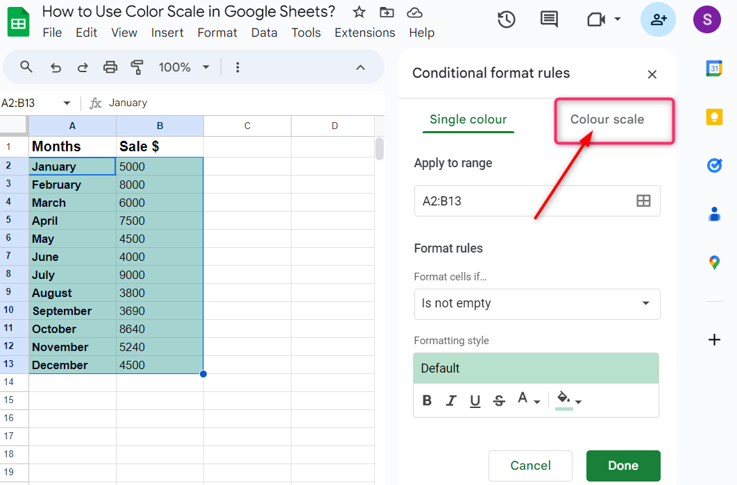
Step 2: On the right side of the Google Sheets, Conditional format rules will appear. In this section, click on the Colour scale:
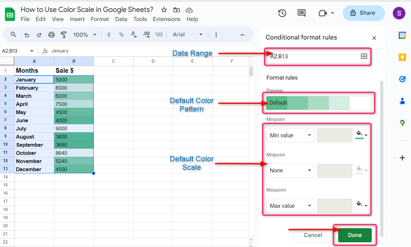
Step 3: Under the Conditional format rules, you will see the data range in the top rectangle box. By default, the green color is selected to visualize the values according to the color scale and the Min value and Max value are the default color scaling. If you are comfortable with default rules, then click on Done and the bottom:
How to Customize Conditional Format Rules in Google Sheets
By default, Google Sheets provides the color scale formatting, by using the Min value and Max value in the selected data on the basis of the smallest and largest values. But there are three more categories to select to customize the color scale in Google Sheets.
- Number Color Scaling in Google Sheets
- Percent Color Scaling in Google Sheets
- Percentile Color Scaling in Google Sheets
1: Number Color Scaling in Google Sheets
In number color scaling, Google Sheets point out and color the values in the selected data on the basis of the minimum, mid and maximum values. This works the same as the Max value and Min value color scaling as mentioned above, but the difference is that we can also select the midpoint in number scaling.
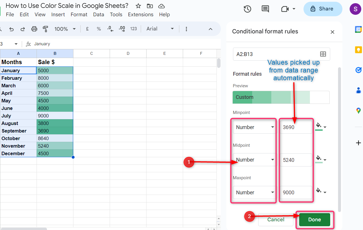
Select the data range and go to the Color scale as mentioned above, then choose Number from the dropdown menu under the Minpoint, Midpoint and Maxpoint then click on Done:

Google Sheets automatically pick the minimum, mid and maximum values from the selected range of the data and color each values accordingly, however, we can also customize the minimum, mid and maximum values of our choice.
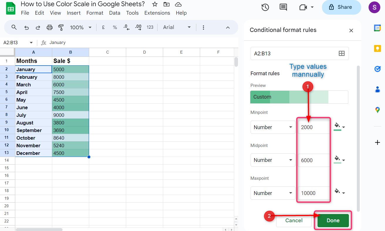
Click on the values after the Minpoint, Midpoint, and Maxpoint then type the value of your choice and click on Done:
2: Percent color Scaling in Google Sheets
In Percent color scaling, Google Sheets visually identify the values by using colors according to the percentage of the values from the total sum of all the values in the selected range.
To customize the color scale according to the percent color scale formatting, select the Percent from the dropdown menu under Minpoint, Midpoint and Maxpoint then click on Done.
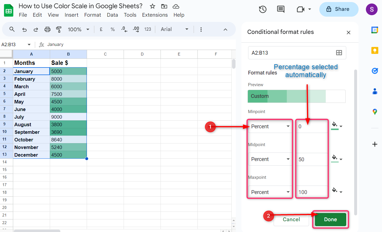
Google Sheets automatically selects 0, 50, and 100 as percentages after the Minpoint, Midpoint, and Maxpoint. To customize percent scaling, click on percents after the Minpoint, Midpoint, and Maxpoint scale boxes to manually type the percent scaling of your choice and then click on Done:
3: Percentile Color Scaling in Google Sheets
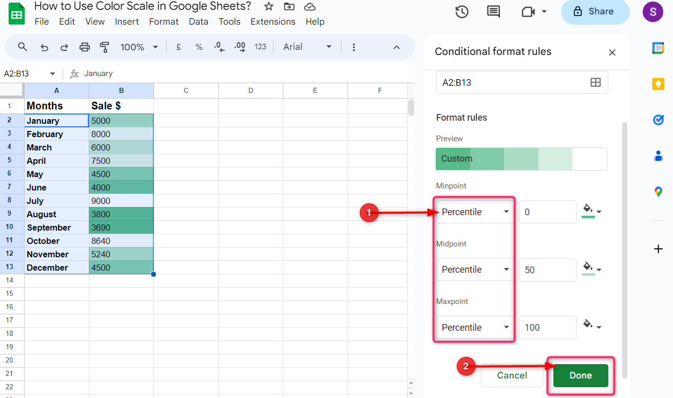
In Percentile color scaling, Google Sheets visually identify the values using colors on the basis of how much the value is below the specific value in the selected range of the data. In simple, percentile color scaling is used to display the values according to their rank or position in the data.
To customize the color scale according to the percentile, select the Percentile from the dropdown menu under the Minpoint, Midpoint, and Maxpoint then click on Done:

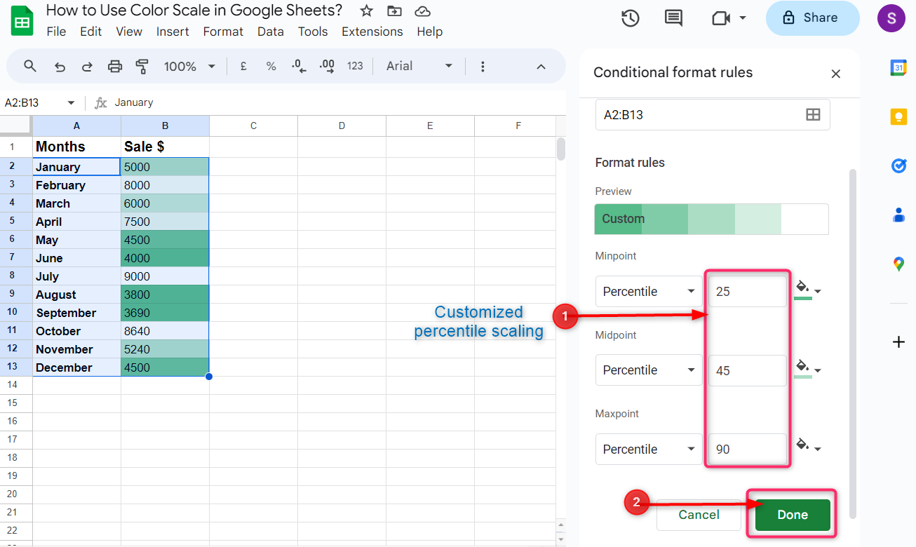
Google Sheets automatically selects the percentile ranking of the values according to minpoint, midpoint and maxpoint as 0, 50, and 100. To customize the percentile ranking, click on the boxes after the minpoint, midpoint and maxpoint percentile boxes to type the percentile ranking of your choice and then click on Done:
How to Customize the Color Scheme in Color Scaling
By default, the green color is selected to visualize the values according to the color scale. To customize the default color scheme, click on the color pattern under the Preview to choose the color pattern of your choice, then click on Done:
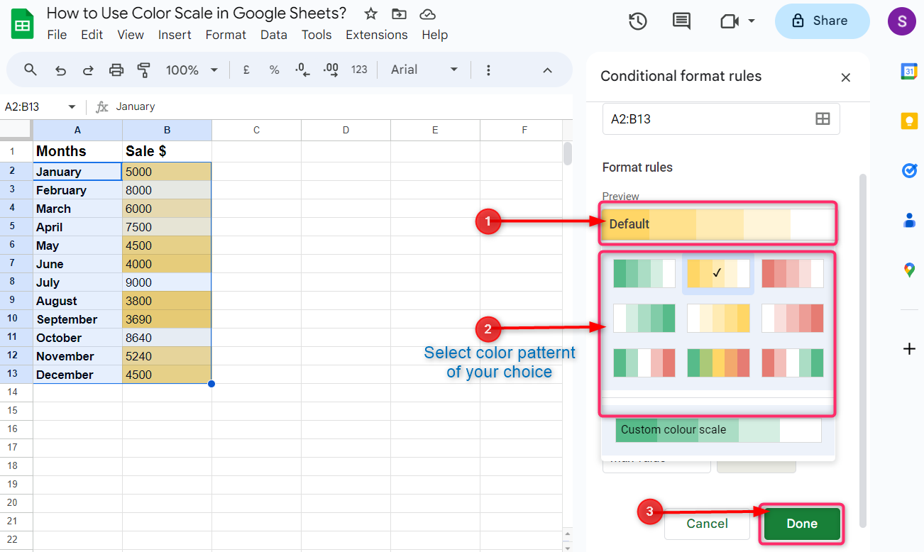
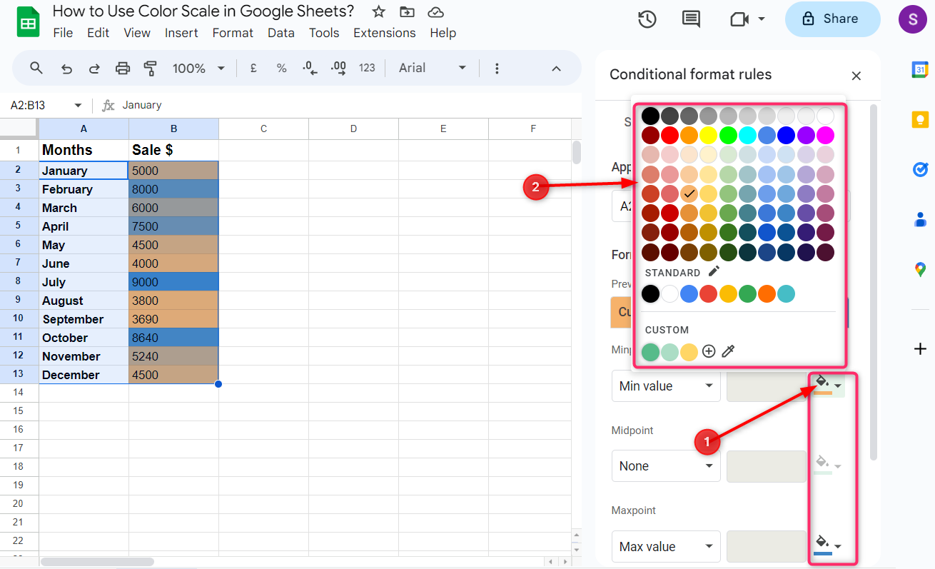
Instead of using the default color schemes, we can also use customized colors for each of the minpoint, midpoint and maxpoint scales.
To customize the color of your choice to visualize the values according to the color scale, click on the color icon in front of the Minpoint, Midpoint and Mixpoint boxes and select the color of your own choice:
Conclusion
Color scale in Google Sheets helps us to identify the maximum, minimum and medium values in large-size at a glance with the use of colors according to the color scale. Click on format from the taskbar and go to conditional formatting and then under conditional format rules, click on the color. Customize the conditional format rules and color scheme according to your choice, then click on done at the bottom.