Charts are a graphical way of analyzing the data. Google Sheets supports different charts for this purpose, one of them is the bubble chart which is used to analyze the data in a single view. It displays the data in the XY plane using bubbles with different sizes depending upon the data. In this blog, we will show you how to create and use bubble charts in Google Sheets.
How to Create A Bubble Chart in Google Sheets?
In Google Sheets, a Bubble chart replaced the data with bubbles to visualize the relationship between different values in the data set. A bubble chart looks very much similar to a scatter chart, but it uses bubbles instead of dot points. We will learn how to create a bubble chart in Google Sheets by taking an example of data step by step as follows.
Step 1: Go to Charts
Select the data range, then click on Insert from the Google Sheets taskbar and click on the Chart in the drop-down options menu:
We can also open the chart by clicking the Kebab menu at the top right in the Google Sheets and then clicking on the Chart icon:

Step 2: Select Bubble Chart
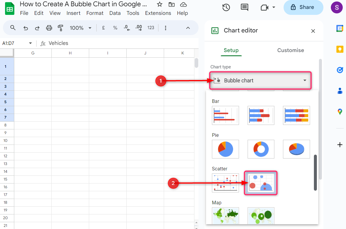
The chart editor will be open at the right of the Google Sheets. Under the Chart type, click on the box and select Bubble chart from the drop-down chart list:
Step 3: Add Size
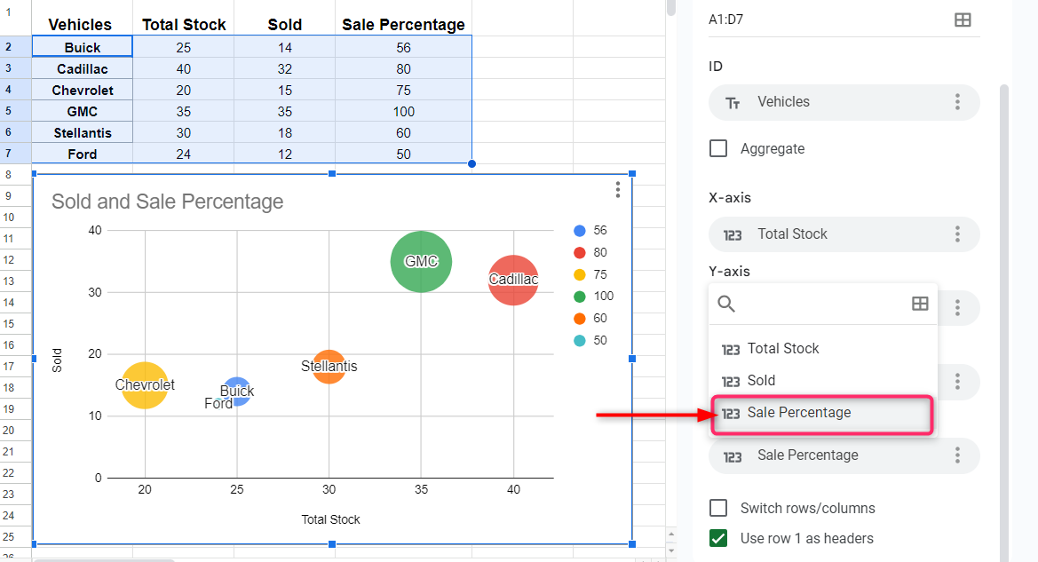
A bubble chart will be open showing the data using bubbles. The first column is used for titles on the bubbles, the second and third columns are set to the X-axis and Y-axis respectively. The bubbles’ colors represent the fourth column in the Google Sheets. Now click on the Add size in the chart editor and select the column that to want to be represented by the size of the bubbles:

In our example, we select the Sale Percentage, which is the fourth column to be represented by bubbles’ sizes:

How to Customize the Bubble Chart in Google Sheets
When we have created the bubble chart, we can customize it to add more elements to it such change the background, style, language, and many more.
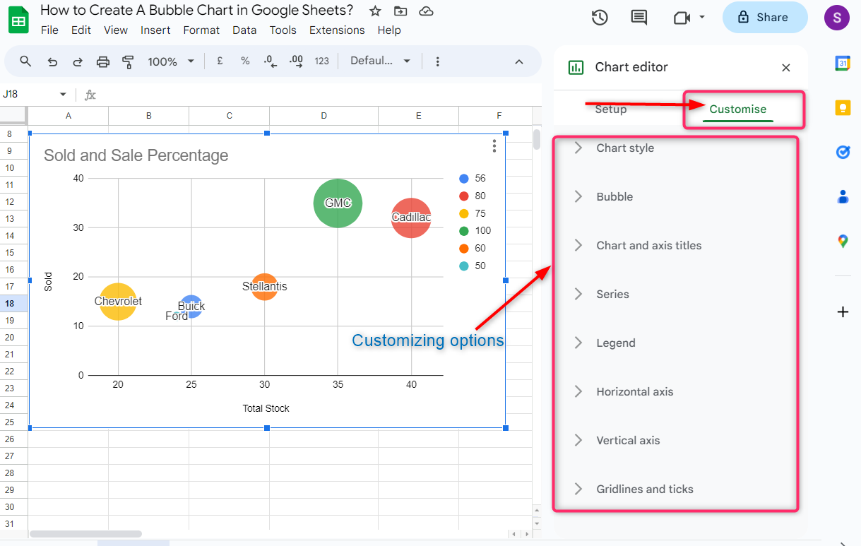
To customize the bubble chart, navigate to the Customise section in the chart editor, as a result, you will see a list of eight different customization options. Each customization option will be discussed in this blog one by one:
1: Chart style
In chart style, we can customize the background of the chart, the text’s font, and the chart border. Click on the boxes under each customizing tool and select from the drop-down options according to your choice:
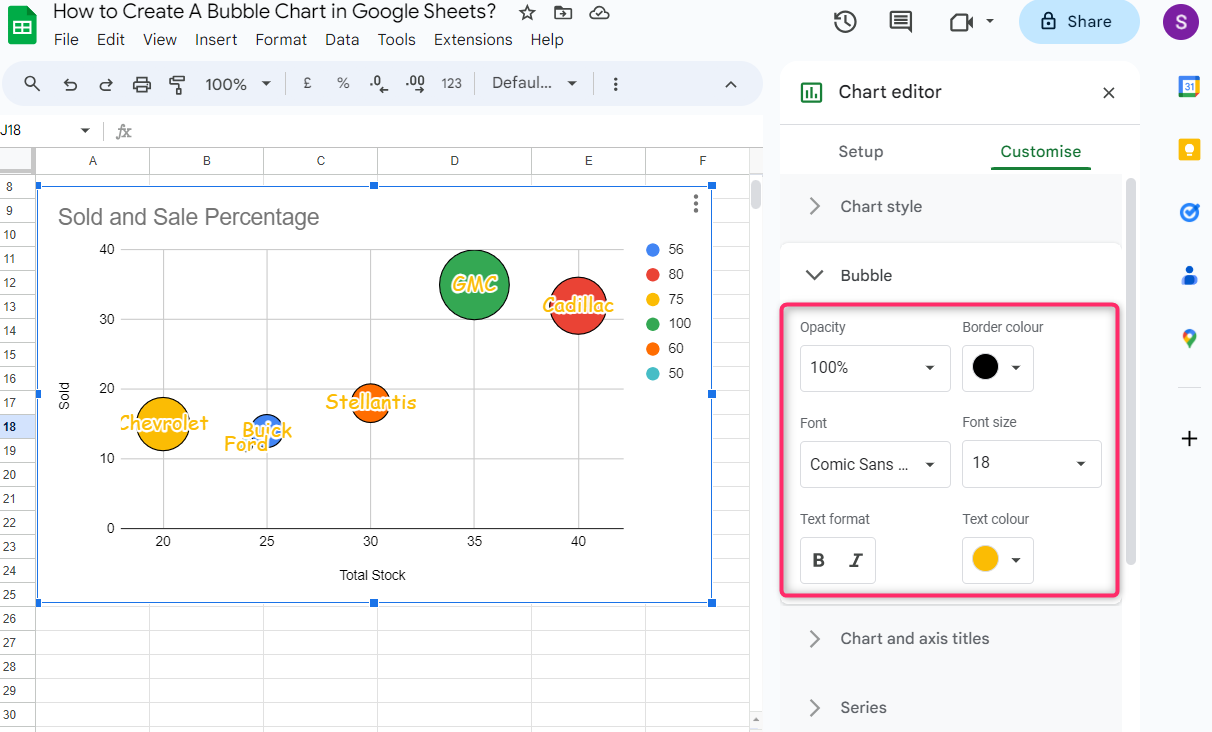
2: Bubble
In this tool, we customize the bubbles’ border color, the colors’ opacity how much light or dark the color in the bubble, text font style, font size, text format, and color of the text used in the bubbles.
3: Chart and axis titles
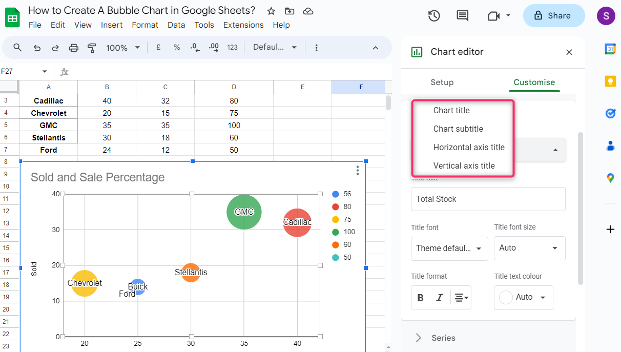
In this customizing tool, we can edit the chart and axis tiles. For each tile used in the bubble chart, we can customize the font style, font size, titles’ text format, and color:
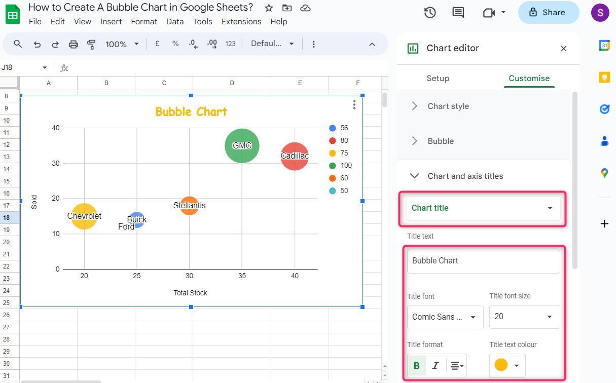
In the same way, we can customize the titles used on the X-axis and Y-axis. We can also create a subtitle for the bubble chart by clicking on the box under Chart and axis titles and then clicking on the title you want to customize from the drop-down options menu:

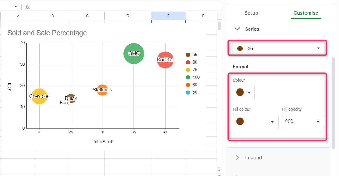
4: Series
With this customizing tool, we can change the bubbles’ color and opacity. Click on the box under the Series and select the data for which we want to customize its bubble, and then click on the boxes under the Fill color and Fill opacity to change the bubble’s color and opacity:
5: Legend
With this customizing tool, we can change the legend’s position, text color, and font size as follows:

6: Horizontal Axis
With this customizing tool, we can customize the horizontal axis’ text format, font size, color, and its logarithmic scale as well. We can also customize the minimum and maximum range of the horizontal axis scale:

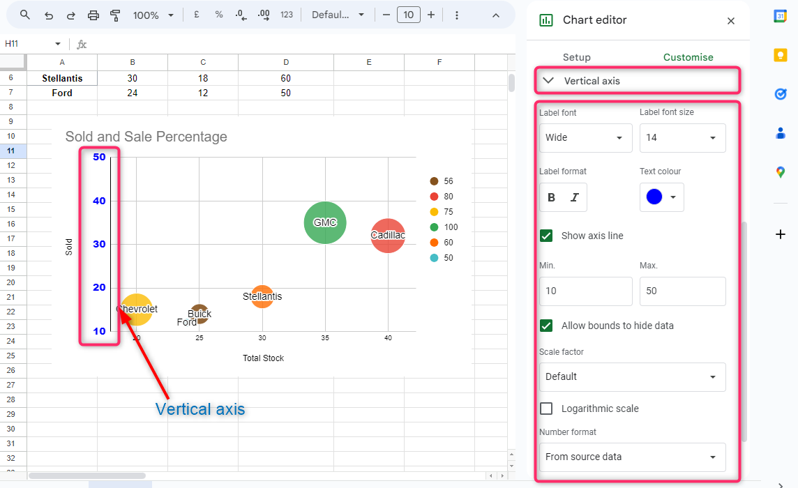
7: Vertical Axis
With this customizing tool, we can customize the vertical axis’ text format, font size, color, and logarithmic scale as well. We can also customize the minimum and maximum range of the horizontal axis scale:
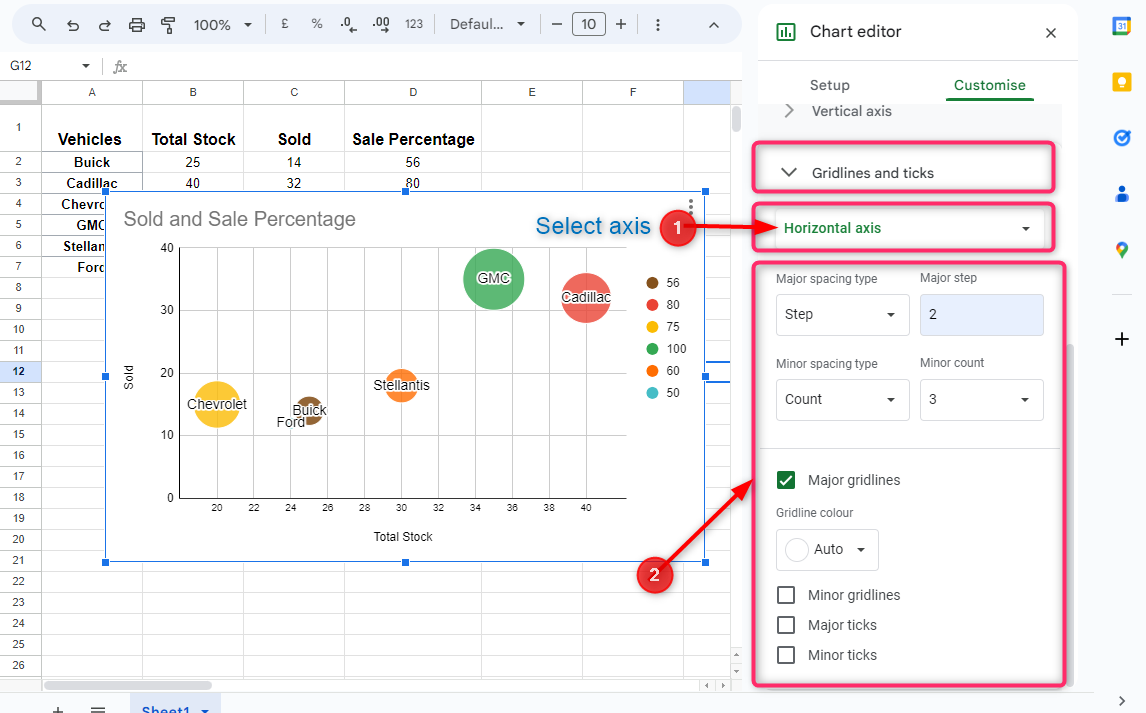
8: Gridlines and Axis
In this section, we can customize the major and minor grid lines and ticks on the X and Y axes. Check the boxes under major gridlines, miner gridlines, major ticks, and minor ticks if you want to show them on the bubble chart:
Conclusion
A bubble chart in Google Sheets uses bubbles to show the comparison of the values in the data. To create a bubble chart, select the data range then click on the format in the Google Sheets taskbar and click on chart in the dropdown menu. Scroll down a little in the chart editor at the left of the Google Sheets and click on Bubble chart as mentioned above. Click on Customise at the top in the chart editor to customize the bubble chart according to your choice with eight different customizing tools.