Using one image for every possible viewpoint variation of a design (desktop, laptop, tablet, mobile, and all the non-standard browser window sizes in between) isn’t exactly ideal in terms of design and maintaining the image’s resolution. With the Responsive Breakpoints Generator, however, you can now use actual equations to tell your images when to break.
Instead of guessing or choosing arbitrary breakpoints for your images, you can use the Responsive Breakpoints Generator tool to come up with breakpoints that have been calculated based upon the original dimensions of your image at full size using the generator’s advanced algorithms.
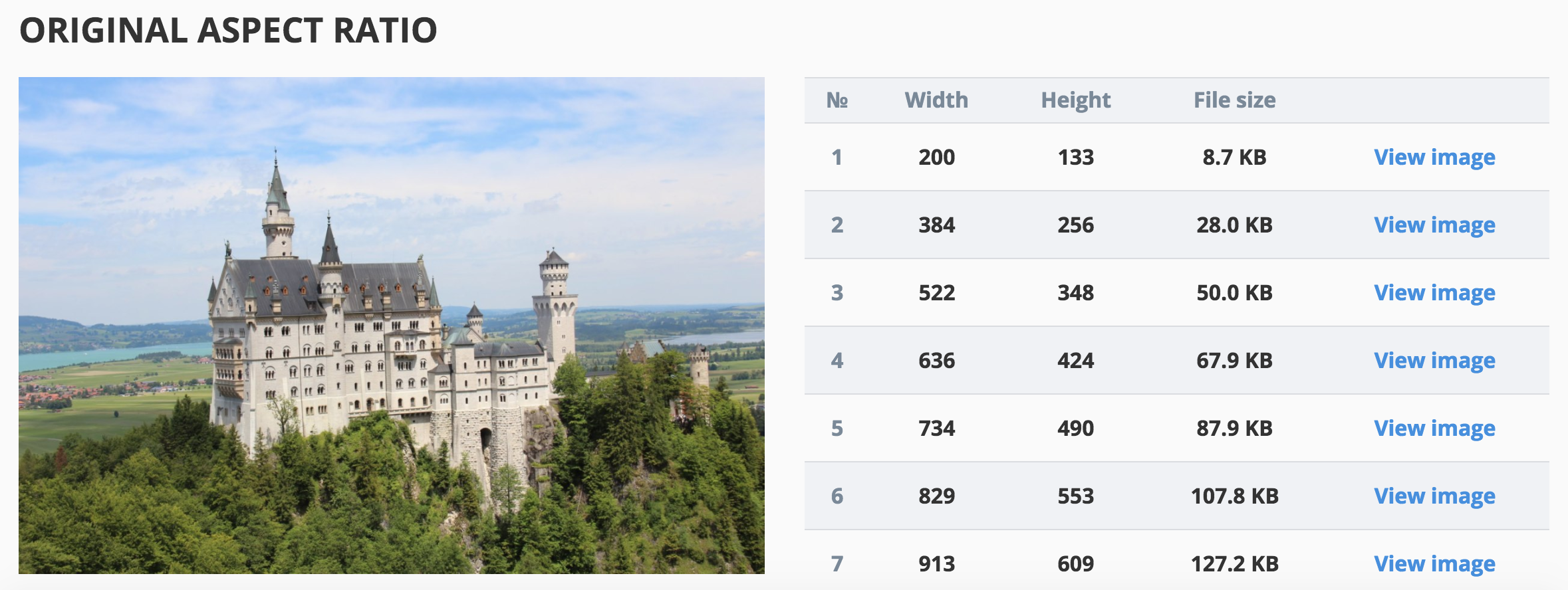
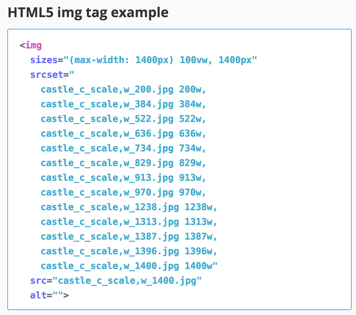
The key to the algorithm being able to find suitable breakpoints is that it finds image width values and accompanying dimensions that offer reductions in file size. After the breakpoints have been created, the generator also provides you with an HTML img tag that lists all of the breakpoint values and the option of downloading a zip file with the original image sized down to all of the breakpoints.
This is a great tool to use, especially if you find yourself doing a lot of design or development for mobile. The tool is also open source, so you can use and/or modify it however you choose. Read more about how the algorithm works here.